Tuesday, April 5, 2016
THREE THINGS INDIE (SELF-PUBLISHED) AUTHORS WISH STOCK PHOTOGRAPHERS WOULD DO
Traditional and independent publishers alike often turn to
stock photography when designing book covers. If you’re a stock photographer,
you can increase your chances of seeing your work on the cover of a book by
following a few simple suggestions:
Orient your photos vertically. A book is itself
a vertical object; it needs a vertically-oriented picture for the cover. Even
if it’s an e-book, an author or publisher will most likely choose an image that’s
oriented in this fashion (horizontal images don’t make attractive thumbnails on
Amazon pages, and stacking or blending multiple horizontal images to make a
vertical cover can get clunky fast). When doing my own image searches at stock
image sites, I immediately filter out any horizontal pics.
Don’t center your pictures. Publishers need
space on the photos to insert titles and author names. Place your subject to
the side, top, or bottom, leaving plenty of (sky, walls, road, etc.) to
function as blank space where a publisher can insert text. Remember, too, text
needs to be instantly readable—so think about what kind of texture your “blank
space” has—brickwork, too many clouds, etc. can sometimes be too busy for any
text to be incorporated in a legible way.
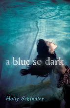
Add emotion or drama. When looking for stock
images for my own cover, I’m not interested in perfection—I’m interested in a
cover that will make a potential reader say, “What’s that all about?” The cover
needs to draw them close enough to read the jacket copy. I need a picture,
then, that promises my book will be an emotionally satisfying experience. Think
about photographing imperfect objects (a torn wedding dress in the mud conveys
far more drama than a pretty wedding dress hanging on a closet door). Think
about taking photos during inclement weather. Think about photographing people
when they’re not smiling.
(Also, as a side-note, think about taking headless
photos. Headless photos on books are so prevalent, they really seem cliché. But
there’s a reason they get picked: you wouldn’t believe how many times I find an
image I love but can’t pick because the subject has a different hair color than
my main character.)
Really, though, maybe the best thing you can do as a stock
photographer is to regularly visit your local bookstore or library in order to
keep up with the latest trends. Be sure to check out several different genres—they
really do follow their own conventions (romance covers and mystery covers can
be completely different animals). Best of luck—and on behalf of independently
published authors, thanks for the hard work you do; you provide the “face” for
our own body of work!
Subscribe to:
Post Comments (Atom)


Really interesting things to think of.
ReplyDelete